
React renderer for HotLayout — server-driven UI (SDUI). A screen is assembled in a visual builder and published as JSON; your app draws it with one component, and the next publish changes the screen without a release.
Quickstart: docs · video · Builder and access: hotlayout.com · try the editor


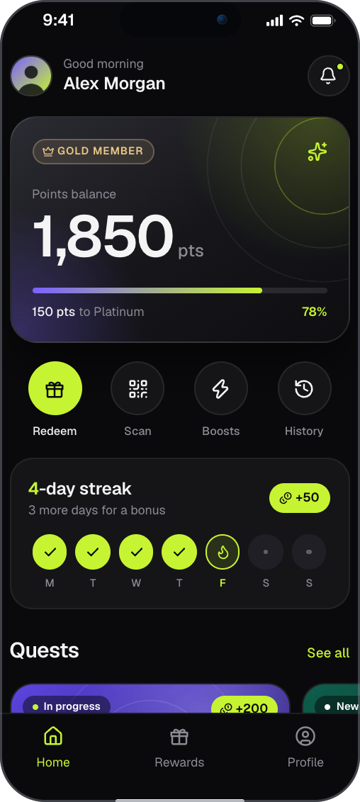
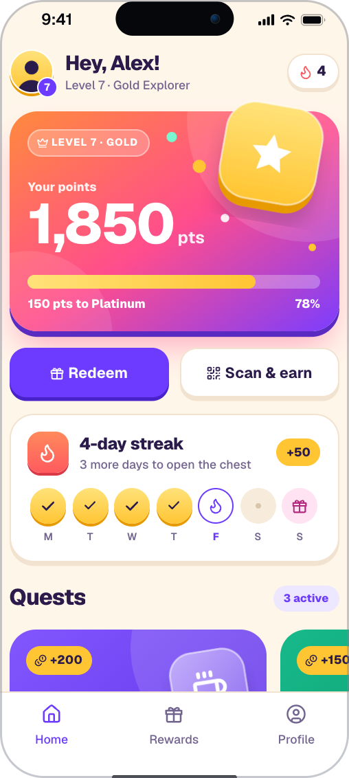
Two screens built in HotLayout. Try the editor in your browser, no sign-up: https://hotlayout.com/try
npm install @hotlayout/reactReact 18.2+ or 19 · ESM with types · no other dependencies · Apache-2.0
import { HotlayoutScreen } from '@hotlayout/react'
import type { ThemeContract, UiDocument } from '@hotlayout/react'

export function Rewards({ layout, theme }: { layout: UiDocument; theme: ThemeContract }) {
  return (
    <HotlayoutScreen
      document={layout} // the layout document, parsed JSON
      theme={theme} // the project theme, parsed JSON; omit it to use the built-in one
      data={{ 'user.firstName': 'Ada', 'user.points': 1250 }}
      collections={{ items: [{ name: 'Coffee', price: 300 }] }}
      locale="en"
      style={{ minBlockSize: '100dvh' }}
      onAction={(action, source) => {
        console.log('the user asked for', action.type, action.params, 'on', source.nodeId)
      }}
    />
  )
}
That is the whole integration: give the component a document, a theme and data, and tell it what your app does with actions.
- The examples call the variable
layout, notdocument: inside a componentdocumentwould shadow the browser's owndocument. - Give the root a height (
style={{ minBlockSize: '100dvh' }}). The root is a flex column that takes the size you give it, the screen background reaches its bottom, and modal sheets sit on the bottom edge of its area. - Where
documentandthemecome from is up to you: bundle them, fetch them on the server, or load them by URL so that a republished screen reaches users without a deploy. The published files are static JSON readable without a token; see Delivery and Load the published document and theme. - The keys of
dataandcollectionsare the project's data dictionary, downloadable from the admin asdata-contract.json; see Data dictionary.
- One component.
<HotlayoutScreen>draws the document, keeps the screen stack, tabs, forms and modal sheets, and hands your app the actions. - Server rendering. No
windowon import, no network, no globals; works in a Next.js App Router Server Component without a wrapper. - Right-to-left scripts. Direction follows the language that is shown; layout, icons and arrow keys mirror.
- Accessibility built in. Real buttons and inputs, focus management, WAI-ARIA tabs and dialogs.
- Untrusted input. The document and the theme are parsed again where they become CSS, an address or a key — see Security.
- Nothing but React. No runtime dependencies besides
reactandreact-dom; styles are scoped to the component's own root. - Placements.
<HotlayoutPlacement>draws whichever published document the admin put into a named place of your app. - One document, four platforms. The same JSON is drawn natively by
hotlayout_flutter(Flutter), hotlayout-ios (SwiftUI) and hotlayout-android (Jetpack Compose). All readers follow the open contract.
- Keeps the screen stack:
navigateandnavigate.backwork out of the box, and a screen withpresentation: 'modal'is a bottom sheet with dialog semantics (focus moves in,Escor a tap on the scrim goes back). - Switches tabs, accordions and choice groups itself; the document only says the initial state.
- Applies the compatibility policy: an unknown widget draws its children, an unknown token is skipped, a document of another schema major is refused loudly.
- Never blanks the screen: an unreadable theme falls back to the built-in one
and an image without a usable address is drawn as a neutral placeholder; you
are told through
onReport. - Sets
dirfrom the language the document is shown in and mirrors directional icons; draws motion and blur only when the system does not ask to reduce it. - Makes buttons pressable in an area of at least 48 × 48 px without shifting neighbours.
Spacing, colours and typography come from the theme, layout rules from the contract: the renderer invents nothing.
The component is controlled through props; the ones you reach for first:
| Prop | What it is for |
|---|---|
document, theme |
The published layout and theme (parsed JSON). |
data, collections |
Values and lists the document binds to, keyed by the data dictionary. |
locale |
The language to show; the document's translation is chosen by it. |
entry |
The entry point (screen) to show; change it to drive navigation from your router. |
onAction |
Receives every action the renderer does not run itself (submit, openUrl, catalog actions…). |
onWrite, writablePaths |
What the person typed or chose, and which data paths the document may write. |
onReport |
Every fallback the renderer took, with the reason. |
resolveImageUrl |
Your decision about which image addresses are loaded. |
Every prop, the shape of reports, analytics and the screen-shown event, actions and haptics, layout, forms and the rest are in the React reference.
The package touches no browser global on import, so checkDocumentVersion and
loadDocument work in a Next.js Server Component. Only HotlayoutScreen.js
and HotlayoutPlacement.js carry "use client", so the plain functions of the
entry stay callable on the server. See
Server rendering and Next.js.
This version reads layout documents of schema 9.34.x and themes of theme contract 4.0.x, and embeds icon set 1.0.0. Any 9.x document and any 4.x theme is drawn; React 18 and 19 are supported by every release.
The rule is the contract's: the major must match; a minor only adds
optional things; a patch changes nothing a reader can see. A document of a newer
minor is drawn and the unknown parts are skipped; a document of another major
is refused, and checkDocumentVersion tells you which side is newer.
checkDocumentVersion('9.0.0') // { kind: 'compatible' }
checkDocumentVersion('9.99.0') // { kind: 'newer-minor', documentVersion: '9.99.0' } — drawn, the unknown is skipped
checkDocumentVersion('10.0.0') // { kind: 'incompatible', reason: 'major 10 is not readable by a major-9 reader', relation: 'document-newer' }
console.log(`this build reads schema ${READER_SCHEMA_VERSION}`)
Which package version reads which schema, and what each schema minor added: Versions in the reference and Compatibility. Changes between package releases: CHANGELOG.md.
The layout document and the theme arrive over the network, and whoever can publish them can change what your users see. The builder validates both on publish, but the renderer does not rely on that: every value is parsed again at the point where it becomes CSS, an address or a key.
- Nothing becomes CSS it was not meant to be. Colours, numbers and token names pass an allow-list of their form before they reach a style.
- Images:
https:only. An image address is loaded only if it is an absolutehttps:URL with a public host name; anything else is drawn as the placeholder and reported. Narrow it further, or route images through your proxy, withresolveImageUrl. - The document cannot choose where it writes. With
writablePaths(a list or a predicate) a write to any other path never reachesonWrite; without it, any path of the dictionary form is allowed, but never__proto__,constructororprototype. Name the paths your app accepts. - A malformed document does not crash your app. A node of the wrong shape
is ignored and reported (
ignored-input); an error inside a screen is caught by the package, also on the server. - The root clips its content and its styles are scoped to its own root, so the screen cannot cover or intercept clicks on your page.
The full guarantees, what the package does not guarantee and the Content-Security-Policy to use: Security model.
Everything below lives on hotlayout.com/docs.
Get started
- Quickstart for React — install, first screen, loading, data, actions, writes, analytics, Next.js
- React reference — the complete reference, by topic: API · Actions and navigation · Screen layout · Data · Forms · Theme · Fonts · Languages and right-to-left · Styles and isolation · Accessibility · Placements · Updating a screen without a release · Limitations
- Embedding the editor
Concepts
- Delivery — how a published document reaches the app
- Placements — named places that show what the admin chose
- Data dictionary — the paths and lists a document may bind to
- Theme · Localization
Reference
- Widgets — every widget and property
- Compatibility — the version rules and what an older reader shows
- Contract changelog — what each schema version added
- Network requirements · Self-hosted
Also: the video quickstart, and the builder at hotlayout.com. To get access, use "Get access" there or write to contact@hotlayout.com.
Apache-2.0 — see LICENSE.